
For our collaborative project we had the idea of redesigning the Recreation room in college, as well as doing some murals around the college. We could get Interior design involved for a new layout of the recreation room.
Redesign Recreation Room:
- Move furniture around
- Paint walls / Murals –
- Collab with interior design to rearrange room
- New pool cues and ping pong paddles
- Information Stand – mop, class info, tutor info, canteen info(menu)
- Board Games
- New pillow cases
College Murals:
- ‘CDCFE’ Mural
- Graffiti Mural
- Direction Sign
- Designs on doors
- Toilet sign
Myers Briggs – Personality Test:

My result from the personality test was that i am a ‘Mediator’, and after reading the profile of a Mediator, i found the description quite accurate.


Adobe Designer Test:

My Evaluation
I feel the results from these personality tests are accurate. I would consider myself a Mediator, i may come across as quiet or shy, but i let my passions shine when ever i can. I tend to put a lot of my focus on myself and my goals, i enjoy working on my own and being creative but when asked to work in a team i will do what it takes for the success of myself and my teammates.
10/10/2019 – Further Brianstorming:
Today Myself, Nicola, Lyle, and Alexis all came together to discuss our ideas more. We have decided we want to promote well-being through murals around the collage.

There are a lot of creative people in our campus and we want the collage to be a place of inspiration. So our idea is to design murals for the college walls but also have inspirational and motivation quotes within the murals.
Inspirational Quotes Ideas:
- “Creativity is a wild mind and a disciplined eye”
- Creativity is nothing but a mind set free”
- “Why fit in when you where born to stand out”
Mural Ideas:
- Floral Mural
- Typography Mural
- Beach / Palm Tree Mural
- Eye Mural
- Angel Wings Mural
Some ideas i put together on Illustrator:


17/10/2019 – Inspect possible Wall Space:
Today myself and Nicola decided to walk around the college and measure certain walls we thought would be suitable for our murals. We want our murals to have a big impact on the college so we want to use large wall spaces.
We found that the largest wall space available was 48inch X 96inch, which is roughly 4feet X 8feet. There are a few of these large spaces around the college so there is lots of room for different murals.


")
The next step is to research what makes a good mural. How certain colors and shapes make people feel. We want the college to feel safe and comfortable, yet inspiring and creative.
24/10/2019 – Research Colors & Emotions:

– An Article from 99designs.ie by Alison S. Gremillion.
Colors & Emotions:
The way different colors can affect emotions depends largely on a color’s brightness, shade, tint or tone and whether it’s cool or warm toned.
Warm Colors:
Red, orange and yellow are next to each other on the wheel and are all warm colors. Warm colors often evoke feelings of happiness, optimism and energy. However, yellow, red and orange can also have an attention grabbing effect and signal danger or make you take action (stop signs, hazard warnings and barrier tape). Red can also increase a person’s appetite.
Cool Colors:
Cool colors include green, blue, and purple. Cool colors are usually calming and soothing but can also express sadness. Purple is often used to help spark creativity as it’s a mixture of blue (calm) and red (intense).


Happy Colors:
Happy colors are bright, warm colors like yellow, orange, pink and red. Pastel colors like peach, light pink or lilac can also have an uplifting effect on your mood. The brighter and lighter a color, the more happy and optimistic it will make you feel.
Sad Colors:
Sad colors are colors that are dark and muted. Black and grey are the quintessential sad colors, but dark and muted cool colors like blue, green or neutrals like brown or beige can have a similar effect on feelings and emotions depending on how they’re used.


My Evaluation:
It is clear, that for us to get our message across through our murals, we have to use certain colors that make our fellow students feel happy and safe, yet excited and inspired. We have to use warm and happy colors, yellows, reds and oranges, these are the colors that will evoke optimism and excitement through out the college. As well as bright and vibrant colors, greens, pinks, peach and purple. We also have to be careful not to use over saturated colors, this could make the murals over whelming and hard to look at.
Mural Artists:
Fran Halpin
“My name is Fran and I specialise in mural painting. I create murals that transport the viewer into another reality by transforming what was once a blank space into a land full of colour and detail. The images I create hold the viewers’ attention and calm the soul.” – https://www.frantheartist.com/

This is an example of Frans work in the Beacon Hospital. On her website she states…
“In the ‘Beacon for kids’ for example my murals help captivate children with challenging learning disabilities and keep them calm and distracted while the doctors and nurses are examining them. The nurse was telling me that one little boy with severe autism, who hates enclosed spaces, sat for an entire hour looking at all the details I had added to an underwater scene. His parents were totally stunned and quite emotional at his reaction and were very thankful for the magical world I had created in this room.”
 What i love most about Frans work is that she is more concerned about how her art will make people feel. As she states above, she wanted her Beacon Hospital murals to feel calming for the children.
That is what we need to focus on when creating our college murals, we dont just want the college to look nice but we want the students to feel the effects of our murals.
James Earley:
James Earley is an artist based in Dublin, Ireland. His distinctive style celebrates and pays homage to his family’s rich artistic past within Irish stained glass art.

In 2014, James painted Blooms Hotel (above). The project took one year to complete and is the largest public artwork in Ireland to date. He has traveled extensively with his art throughout Europe, the States, Asia and has worked on a variety of large scale projects with a mixture of arts-based organisations as well as multi-nationals that support the arts.

7 Principles of Design Murals:
We have decided on the idea of designing our murals based on the 7 Principles of Design, emphasis, balance and alignment, contrast, repetition, proportion, movement and white space. There are 7 people in our group so each member has been given a particular principle in each they must design their mural around. I have been assigned the principle of Repetition.
Repetition:
“If you limit yourself to two strong typefaces or three strong colors, you’ll soon find you’ll have to repeat some things. That’s ok! It’s often said that repetition unifies and strengthens a design. If only one thing on your band poster is in blue italic sans-serif, it can read like an error. If three things are in blue italic sans-serif, you’ve created a motif and are back in control of your design.
Repetition can be important beyond one printed product. Current packaging design is heavily embracing beautiful illustrated patterns. Anyone thinking about a startup knows one of the first things you need is a strong logo to feature on your website, business cards, social media and more. Brand identity? Another term for repetition.” – https://99designs.ie/blog/tips/principles-of-design/
History of Repetition in Art:
If we turn away from the definition of repetition in art and avoid to comment on every repeated line, surface, color, pattern, and image in visual creativity, today aided by the computer-based images, our attention is undoubtedly turned towards the concept and the inner workings of the artist or the particular period of production and the decision as to why they used repetition. We enter a world that speaks about the repetition in the choice of the subject matter, evident in the production of Claude Monet, Wassily Kandinsky, Kazimir Malevich, that formed some of the most influential avant-garde movements, or a world that uses repetition in art as a commentary tool of consumerism and mass production, decorating the creativity of Andy Warhol or various Minimalism artists.
Repetition Artists:
Over the last two millenniums, many artists of both the past and the present have focused on constant depictions of the same subjects and motifs in their work as this repetition is encoded in the very DNA of art creating – practice makes perfect.
Piet Mondrian:
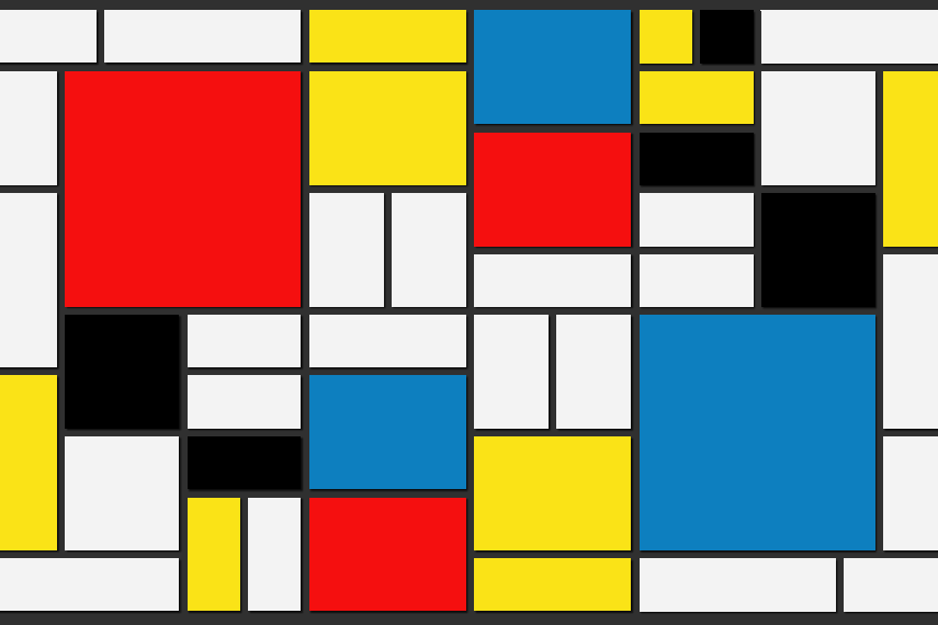
Piet’s entire output was consisting of repetitive depictions of squares with different colors, separated by strict bold lines. Mondrian’s discipline in presenting squares is one of the most famous repetitive concepts in art and the Neo-Plasticism theory behind them was a key moment of abstraction in painting.
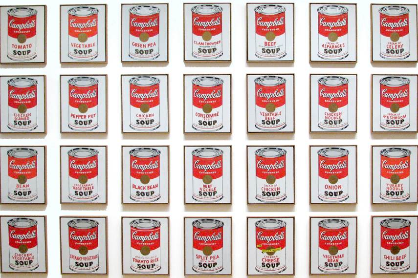
The unofficial king of repetition art, Andy Warhol is the legend of the Pop art phenomenon and one of the most commercialized names of the 20th century. Inspired by the imagery of popular culture, Warhol simultaneously celebrated and criticized consumption choices and mass (re)production, effectively turning his work into a repetitive whirlwind and establishing the grounds for the most successful Post–World War II art movement.
My Poster (Repetition):
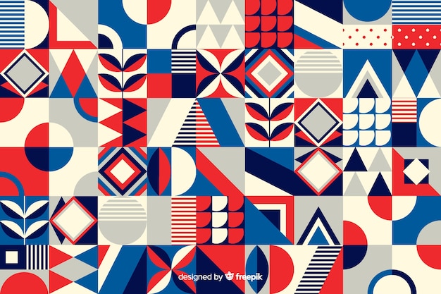
For my poster, the element of ‘Repetition’ needs to be captured. I like the idea of geometric pattern. See Examples below…

I then attempted my own geometric pattern on Illustrator… 
(My artwork^)
I will continue to expand of this idea and play around with different color palattes.
Below are some thumbnail sketches of patterns. I will develop all in Illustrator and choose which i like best.


(My artwork^)
My Final Poster:


Group Poster Presentation:

